Graphic design · Campaigns
Social Media Campaigns
Visual systems, not one-off posts.
- Role
- Graphic design, layout and videography
- Clients
- Founders Edge, Towzen
- Formats
- Event visuals, posts, video, publication pages
- Focus
- Typography, colour and repeatable templates
Each set of graphics below runs on a small set of repeating rules for type, colour and layout. New posts are built from those rules, so the feed reads as one campaign instead of a collection of separate designs. Some Founders Edge work, including pitch decks, is confidential and not shown.
Startup community · 2026
Founders Edge
Event promotion and publications for a Sydney startup community that runs workshops and talks for founders.
See more on LinkedIn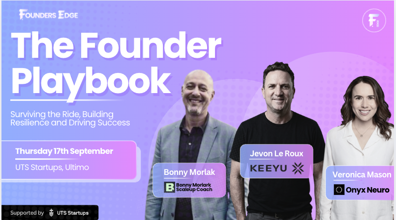
Goal and audience
Founders Edge hosts regular startup events in Sydney, from hands-on workshops to interactive talks, covering both hard and soft skills. Its audience is founders at every stage who want to learn, connect and grow.
The graphics had two jobs. Event visuals needed to make each session feel worth showing up for. Guides and recaps needed to turn expert advice into pages founders could scan quickly.
Visual identity
Colour
A lavender-to-pink gradient runs through every piece. It reads as energetic and modern without feeling corporate, which suits a founder audience.
Typography
Headlines use a heavy geometric sans with the same gradient fill, so a title is recognisable before it is read. Body text stays dark and plain for readability.
Texture and shape
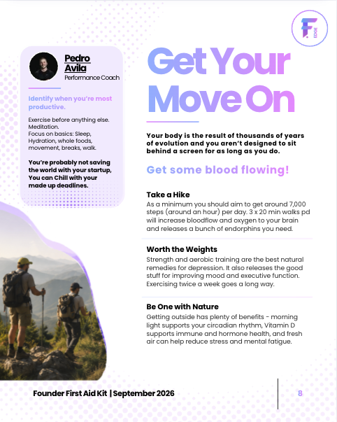
Halftone dots and frosted, rounded cards add depth and keep speaker names and quotes visually separate from the background.
Template system
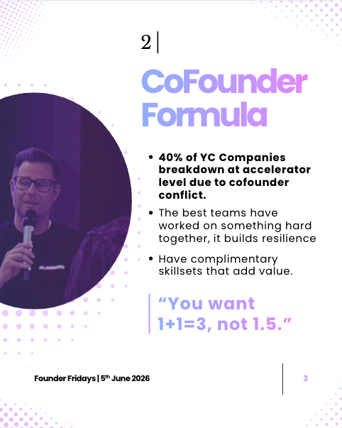
Every page shares fixed anchors. The logo badge sits top right. The gradient headline leads. A footer rule carries the series name, date and page number. Speaker cards always pair a photo, a name and the company logo.
Because the anchors stay put, a new event or a new guide only needs new content.
Outcome
One system now covers landscape event promotion and two portrait publication series. Each piece is clearly Founders Edge, whether it appears as an event post or as page eight of a guide.
Hospitality
Towzen
Menu promotions and videography for a vegan, Kyoto-style restaurant in Sydney.
See more on InstagramGoal and audience
Towzen needed posts that promote seasonal specials and signature dishes to diners in Sydney. The food had to stay the hero, with just enough type to name the dish and frame the offer.
Visual identity and template
Photography first
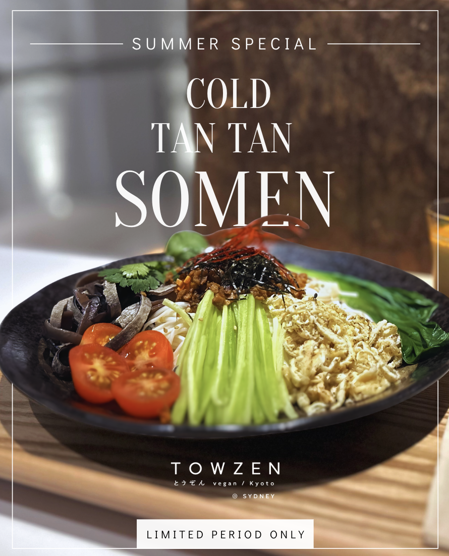
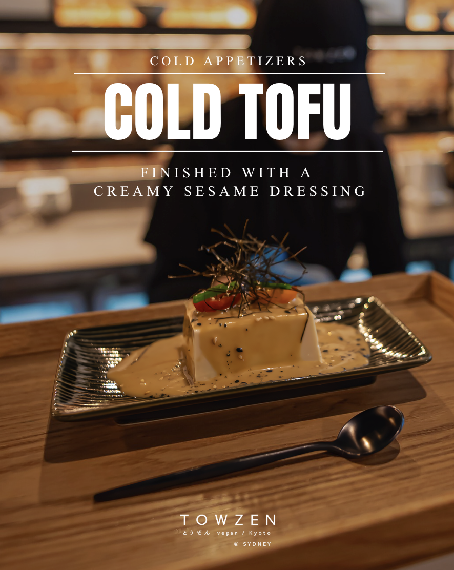
Each post starts from a single dish photo with a soft, blurred background, so the food stays the focal point.
Restrained, elegant type
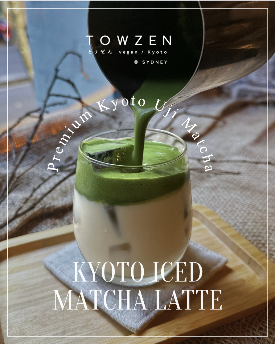
A high-contrast serif names the dish, paired with small, widely spaced capitals for the category. A thin white frame and the Towzen wordmark with its Japanese name repeat on every post.
Room for variation
The template flexes by content. A limited-time special gets a call-out tag. A menu category uses a bold condensed headline. A drink feature uses curved type that follows the glass.
Videography
Alongside the static posts, I created video content for Towzen's social channels, using the same calm, food-first look as the photography.
Outcome
Follower growth
@towzen.au · 3 months
Grown through consistent menu posts and video during my time with the restaurant.