Case study · 2026
Quikshot Website
Making a brand-new drink format obvious in a few seconds of scrolling.
- Role
- Web design and front-end development
- Audience
- Investors, stockists and first-time drinkers
- Format
- Interactive product website with scroll-driven 3D and motion
- Status
- Live at quikshot.au
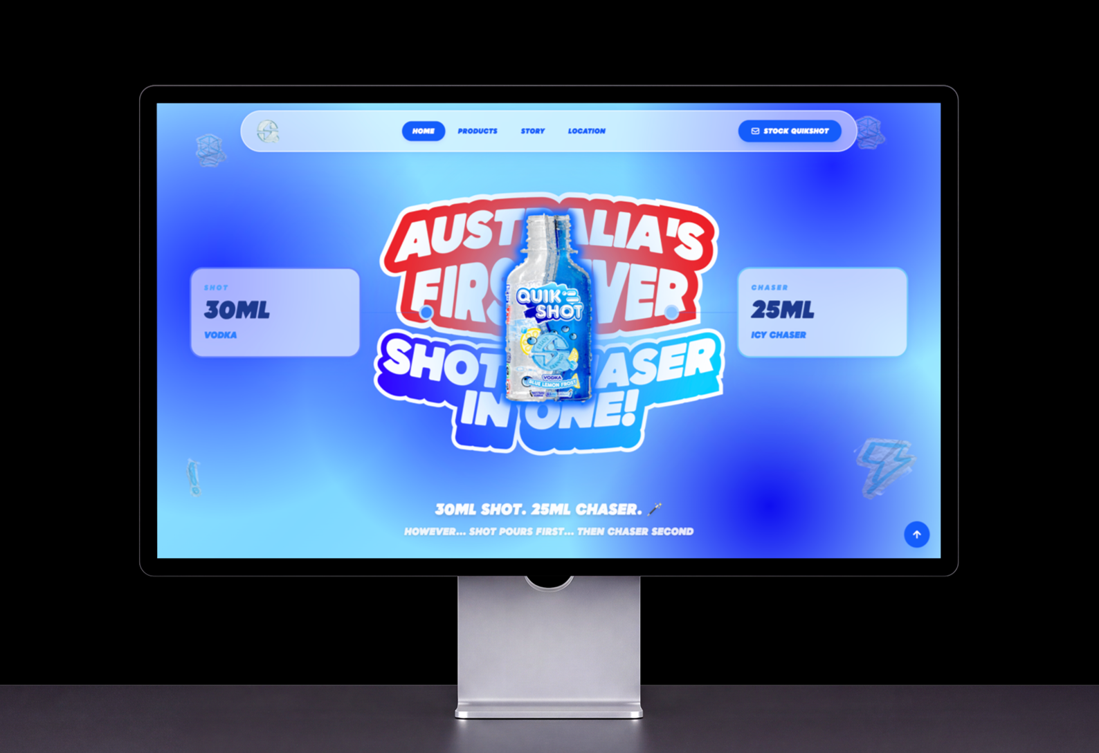
The problem
Quikshot is a 30ml vodka shot and a 25ml chaser in one split bottle. Most people have never seen the format, so they don't know which side to drink first.
The website had to teach the product before it could sell it. A list of instructions would be skipped, so the explanation needed to be the experience itself.
Audience
The site speaks to three groups at once. Investors need to grasp the concept quickly. Venues and retailers need a clear way to stock it. Drinkers need to know how to use it.
Design decisions
Instructions told as a story
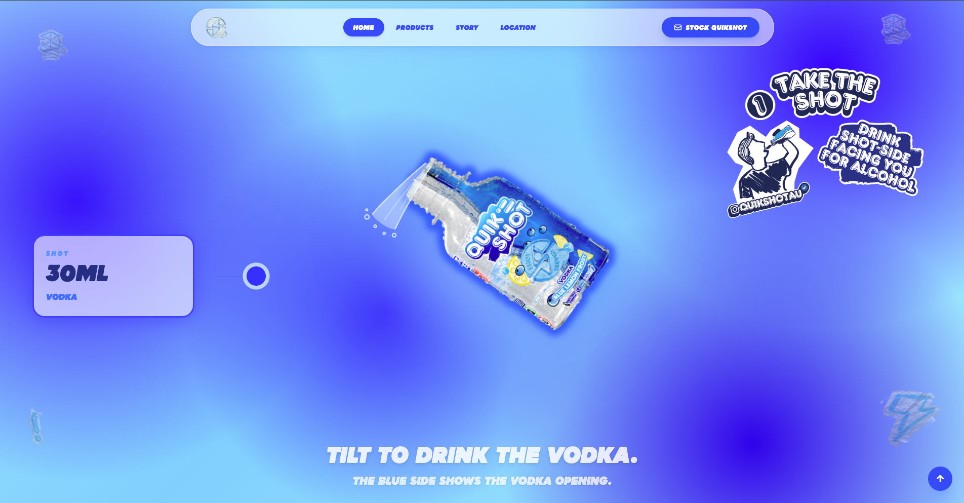
The bottle tilts as you scroll, and each step appears beside it. Visitors watch the shot side pour first, then the chaser, instead of reading about it.
Type with the same energy as the bottle
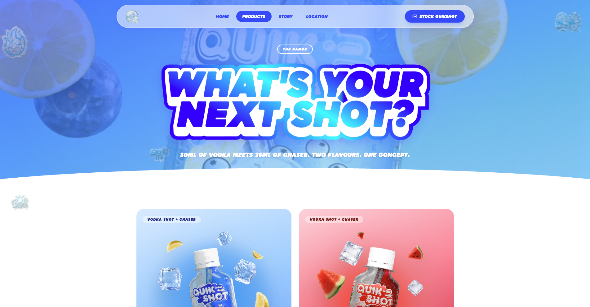
Heavy italic display type, thick outlines and sticker-style labels echo the bubbly bottle logo. The tone stays playful while the key messages stay readable at a glance.
Colour that signals flavour
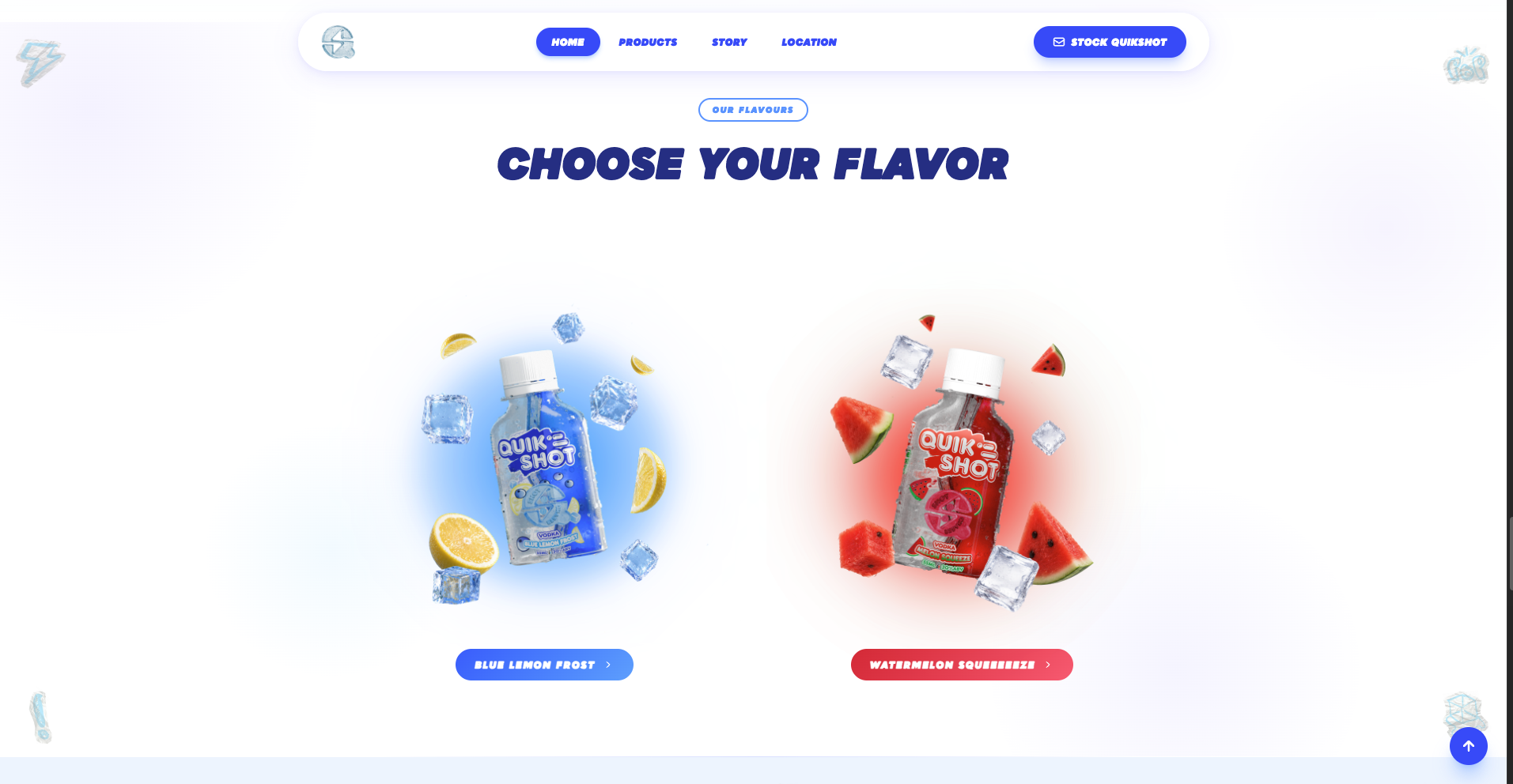
Each flavour owns a colour. Blue carries Blue Lemon Frost and red carries Watermelon Squeeeeze, through the glows, cards and buttons, so the range is easy to tell apart.
One clear hierarchy
Product specs sit in frosted cards beside the bottle. A single primary action, Stock Quikshot, stays in the navigation for stockists.
Outcome
The site is live at quikshot.au. It explains the product, presents the flavour range and gives stockists a direct path to get in touch, all in one visual language.