ISANSW Redesign
Transforming a fragmented student portal into a cohesive digital home for the Indonesian Student Association of NSW.
Context
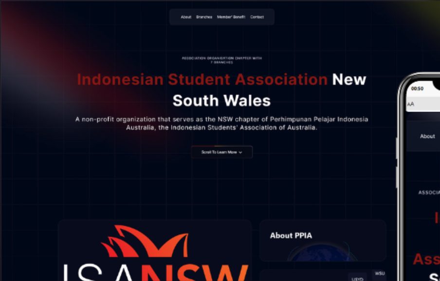
The Indonesian Student Association of NSW (ISANSW) serves thousands of international students across multiple universities. Their previous digital presence was scattered across disconnected platforms, leading to confusion and missed engagement opportunities.
My role was to lead the end-to-end redesign—establishing a new visual identity that felt culturally authentic while building a scalable Next.js architecture that the student team could maintain for years to come.
The Core Problem
Why the old site wasn't working
Identity Gap
The existing site felt corporate and cold, failing to reflect the warmth and vibrancy of Indonesian culture that students experience at events.
Low Engagement
Information was buried deep in nested menus. Students defaulted to Instagram DMs for basic questions, overwhelming the committee.
Limited Interaction
Users had no reason to stay. The site was a static noticeboard with no interactive elements or community showcase.
A strategy built on cultural connection.
We shifted from informational to experiential, focusing on delight and ease of use.
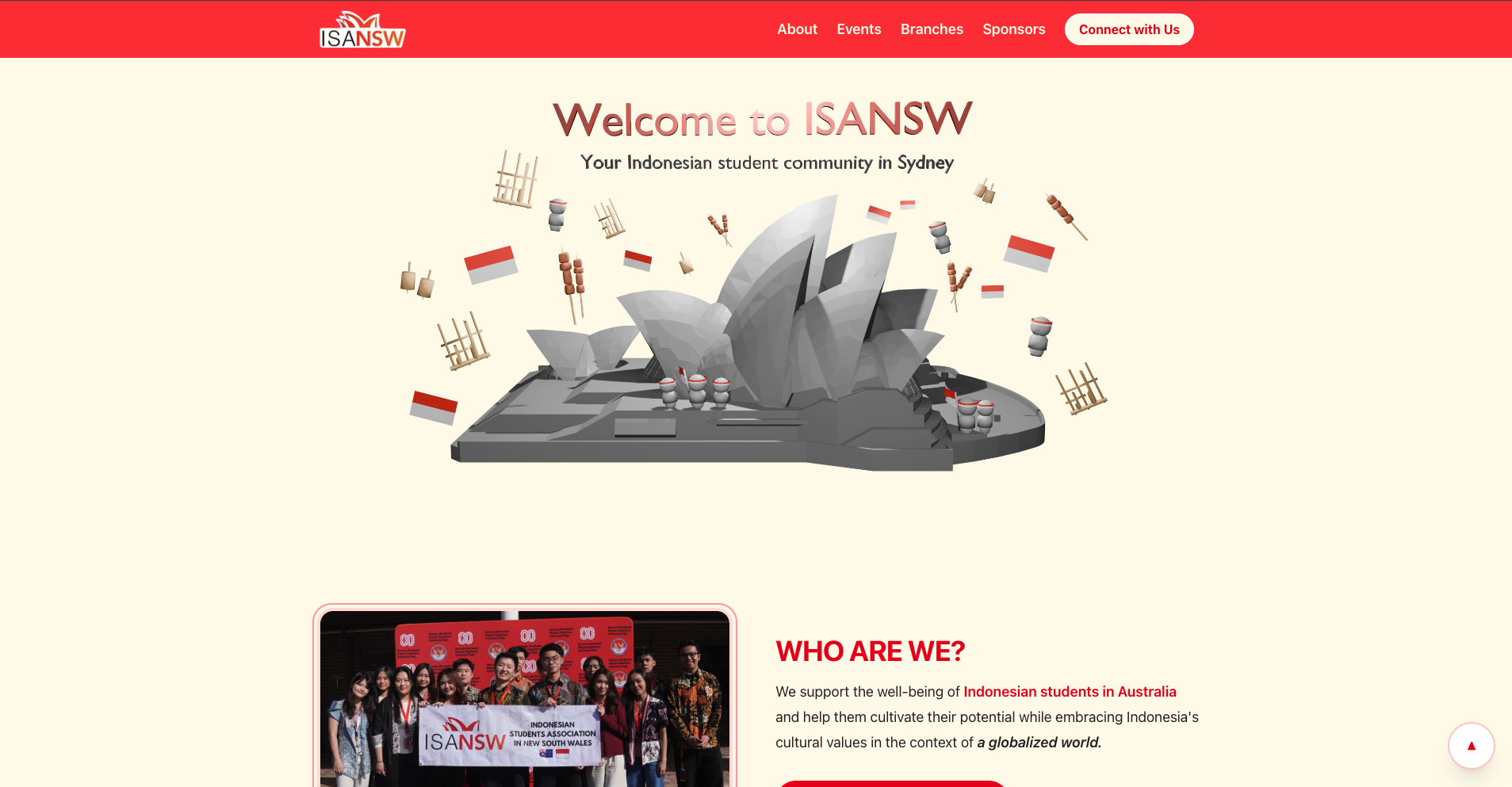
Culture-First Visuals
Integrating Batik motifs and warmer tones to evoke a stronger sense of home.
Clear Hierarchy
Flattening the navigation structure to surface key events and pathways more clearly.
Interactive Moments
Introducing motion and 3D elements to make the site feel more alive and memorable.
Design-to-Build
Establishing a component-led system so the live site could stay consistent and scalable.
Campus Landmarks in 3D
To make branch exploration feel more recognisable and memorable, I designed a set of low-poly 3D university landmarks across NSW. The active campus sits front and centre, while nearby campuses remain visible as part of the wider network.
UNSW
UNSW Main Library
A recognisable landmark that helps students instantly connect with their campus branch.
Before & After
Direct impact on visual clarity
How the experience was reshaped
Rather than treating the redesign as a surface-level visual refresh, each change responded to a specific friction point in the old experience—from unclear hierarchy, to weak campus identity, to a system that would be difficult for future committees to maintain.
Homepage Information Hierarchy
The landing experience was restructured to prioritise the pages students were most likely to need first—events, membership, and key pathways—so the homepage could act less like a poster wall and more like a clear point of entry into the organisation.
Interactive Campus Exploration
Branch browsing was redesigned around recognisable campuses rather than flat text lists. By introducing 3D landmarks and a place-based interaction model, the experience became more memorable and better reflected how students actually relate to ISANSW—through the university communities around them.
Visual Identity Reframing
The visual language shifted away from feeling generic and administrative. A warmer palette, more editorial typography, and stronger image treatment helped the platform feel more community-led, expressive, and culturally grounded.
Opportunity & Sponsorship Ecosystem
Designing a scalable platform to present sponsors, partners, and opportunities that support the community’s growth.
From a static noticeboard to a
living digital home.
By unifying the visual language and redesigning the site structure, ISANSW shifted from a fragmented set of links into a more cohesive and memorable digital home for students.